

Producing data plots is an important part of doing research work. Making
good looking plots is not easy, and getting them right as well is a real
challenge. Perhaps the best way of producing plots, whether for use with LaTeX
or otherwise, is to use the pgfplots
package. For a general overview of using pgfplots effectively, see my TUGBoat
article.
Using a programmatic approach to plotting has several advantages, as the plots
you get are easy to keep consistent. That’s particularly useful if several
people are preparing plots: using a GUI-based approach, it’s hard for multiple
workers to stick exactly to the same look. So it is worth putting some effort
into setting up templates for pgfplots: basic .tex files which can
be modified easily and reused multiple times. Putting a bit of effort into
developing templates also makes it easier to use data directly from a lot of
specialist systems. Many data file formats can be read as either comma or space
separated files, but it can take a little effort to get this right. So by
working on the basics, you can save yourself time later.
There is another advantage to setting up well documented templates. Not
everyone is a LaTeX expert: in my area, most people are not even day to day
LaTeX users. So making clear templates which can be used by altering a few key
settings is a great way to make LaTeX results accessible to more people.
Setting up
Before you can start developing a template, you need of course to have some
data and produce a one-off plot. That process is covered in the TUGBoat
article I mentioned earlier. There are then two big things to worry about:
generalising the .tex, and adding enough comments to let other
people use the template. That second point very important, as is talking to
other people to get things right: there’s no use in creating a template that
no-one can use!
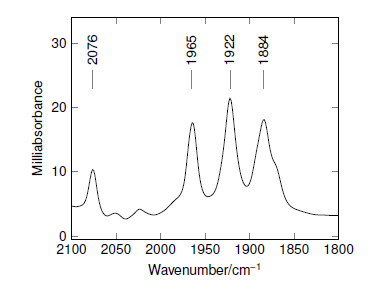
As an example, I’ll use a plot of an infra-red spectrum: this is similar
to one in the TUGBoat article. The original version looks like this:
\documentclass{standalone}

\usepackage[T1]{fontenc}
\usepackage{helvet}
\usepackage{sansmath}
\sansmath
\renewcommand{\rmfamily}{\sffamily}

\usepackage{pgfplots}
\pgfplotsset
  {
    compat                   = newest,
    every tick/.append style = thin
  }
\pgfkeys{/pgf/number format/set thousands separator = }

\usepackage{siunitx}
\sisetup{mode = text}

\begin{document}

\begin{tikzpicture}[font = \sffamily]
  \begin{axis}
    [
      x dir               = reverse,
      xlabel              = Wavenumber/\si{\per\centi\metre},
      xmax                = 2100,
      xmin                = 1800,
      ylabel              = Milliabsorbance,
      ymax                = 34
    ]
    \addplot[color = black, mark = none] table {example.txt};

    \node[coordinate,  pin = {[rotate=90]right:1884}] at
      (axis cs:1884,1.3) { };
    \node[coordinate,  pin = {[rotate=90]right:1922}] at
      (axis cs:1922,1.3) { };
    \node[coordinate,  pin = {[rotate=90]right:1965}] at
      (axis cs:19651,1.3) { };
    \node[coordinate,  pin = {[rotate=90]right:1965}] at
      (axis cs:1965,1.3) { };
    \node[coordinate,  pin = {[rotate=90]right:2076}] at
      (axis cs:2076,1.3) { };
  \end{axis}
\end{tikzpicture}
From one plot to many plots
There are several things to notice about the example. First, there are no
comments: that’s fine for me (provided I remember how it works), but what about
my coworkers? Second, everything is hard coded, for example the file containing
the raw data, which is pretty hard to find. Third, I had to pre-modify the data
file to get it working: the .txt file is based on an instrument
file which is in a text format but which contains lines I needed to remove and
scale. Finally, there is a lot of repetition in the pin part,
which would be better handled using a loop.
The most important change to make is probably adding comments: that’s true of
any form of programming. In this case, that means labelling up the lines which
should be changed, and saying what should go in them. So for example I would
the settings for the axes to read
\begin{axis}
  [
    x dir               = reverse,
    xlabel              = Wavenumber/\si{\per\centi\metre},
    xmax                = 2100, % Alter "2100" to change x-max
    xmin                = 1800, % Alter "1800" to change x-min
    ylabel              = Milliabsorbance,
% Set ymax value to allow space for labels
% Alter "34" to set y-max, or comment out for autoscale
    ymax                = 34
  ]
Making the template more flexible means moving some parts to macros which stand
out. In this template, the most important thing is where the data comes from.
So I would make that a macro right at the start of the file
% The file name for the raw data goes here
\newcommand*{\datafile}{example.txt}
Later in the file, I then use
\addplot[color = black, mark = none] table {\datafile};
Of course, I could have simply added a comment, but that does not work so well
for this type of ‘hidden’ setting. I find that the key-value lists used a lot
by pgfplots work fine with comments, but for other settings using a well-named
macro works better.
Making templates that work directly from instrument data rather than having to
post-process in a spreadsheet can require a bit of effort. Provided you can
save data in a text format (space-, tab- or comma-delimited), the pay-off is
that you only have to do the job once, and can then forget about the problem:
if you have to post-process every time, it’s easy to make mistakes. In the
example, I had to remove some lines at the start of the instrument file to make
it usable: easy to set up using
\addplot[color = black, mark = none] table[skip first n = 2] {\datafile};
Dealing with comma-separated files is also easy
\pgfplotsset{table/col sep = comma}
(the standard setting for pgfplots is whitespace delimited).
Scaling or shifting data points is sometimes necessary, and again pgfplots can
help as it will work with expressions for x and y, not just
values. We can therefore have something like
\addplot[color = black, mark = none]
  table
    [
      skip first n = 4,
      x expr = \thisrowno{0} + 10,
      y expr = 1000000 * \thisrowno{1}
    ]
where the column numbers for a table start at 0 (usually the x value)
and work up. Of course, if the values you need to shift or multiply by are
variable at all, you can store them as commands.
Finally, we can use loops to deal with repetition. I pointed out
that where I added some text markers in the original, things were
repetitive and a loop would work
\pgfplotsinvokeforeach{1884,1922,1965,2076}{% Alter numbers as needed
  \node[coordinate,  pin = {[rotate=90]right:#1}] at
    (axis cs:#1,23) { }; % Alter "1.3" to set height of labels
  }
TikZ experts might wonder why I haven’t used \pgfforeach
here: it doesn’t work!
Putting it together
So what does the completed template look like?
% Template for plotting a single IR spectrum

% The file name for the raw data goes here
\newcommand*{\datafile}{example.asc}

\documentclass{standalone}

\usepackage[T1]{fontenc}
\usepackage{helvet}
\usepackage[EULERGREEK]{sansmath}
\sansmath
\renewcommand{\rmfamily}{\sffamily}

\usepackage{pgfplots}
\pgfplotsset
  {
    compat                   = newest,
    every tick/.append style = thin
  }
\pgfkeys{/pgf/number format/set thousands separator = }

\usepackage{siunitx}
\sisetup{mode = text}

\begin{document}

\begin{tikzpicture}[font = \sffamily]
  \begin{axis}
    [
      x dir               = reverse,
      xlabel              = Wavenumber/\si{\per\centi\metre},
      xmax                = 2100, % Alter "2100" to change x-max
      xmin                = 1800, % Alter "1800" to change x-min
      ylabel              = Milliabsorbance,
% Set ymax value to allow space for labels
      ymax                = 34 % Alter "34" to set y-max, or comment out for autoscale
    ]
    \addplot[color = black, mark = none] table[skip first n = 2] {\datafile};

% A list of labels: put all of the positions in the list.
  \pgfplotsinvokeforeach{1884,1922,1965,2076}{% Alter numbers as needed
    \node[coordinate,  pin = {[rotate=90]right:#1}] at
      (axis cs:#1,23) { }; % Alter "1.3" to set height of labels
    }
  \end{axis}
\end{tikzpicture}

\end{document}
The result is shown in the figure.
Programming for flexibility
Of course, you can make templates as simple or as complex as you like. For
example, we have some data that can come from one of three machines. Two save
directly in text-based files, but the formats are different. The third can only
export data, in .csv format, which is different again from the
other two! I could have written three templates, but as my non-LaTeX using
colleagues need to use them too, a programmatic approach looked better. So I
worked out the three different settings needed, then set up some code to work
out the file extension and set up accordingly
% The file name for the raw data goes here
\newcommand*{\datafile}{100mvn.ocw} % Change "100mvn.par"

% This does the auto-detection of file type
% You don't need to change anything
\newcommand*{\xcolumn}{0}
\newcommand*{\ycolumn}{1}
\newcommand*{\ignorelines}{0}

\newcommand*{\ext}{}
\newcommand*{\getext}{}
\def\getext#1.#2\stop{%
  \expandafter\ifx\expandafter\relax\detokenize{#2}\relax
    \renewcommand{\ext}{#1}%
    \expandafter\getextaux
  \else
    \expandafter\getext
  \fi
  #2\stop
}
\newcommand*{\getextaux}{}
\def\getextaux#1\stop{%
  \ifnum\pdfstrcmp{\ext}{par}=0 %
    \renewcommand*{\ignorelines}{110}
    \renewcommand*{\xcolumn}{2}
    \renewcommand*{\ycolumn}{3}
  \else
    \ifnum\pdfstrcmp{\ext}{ocw}=0 %
      \renewcommand*{\ignorelines}{2}
      \AtBeginDocument{%
        \pgfplotsset{table/col sep = space}
      }
    \fi
  \fi
}
\expandafter\getext\datafile.\stop
You might not want to go that far, but the point is that using LaTeX gives you
the possibility to program this kind of thing. You only need to set it up once,
so it is worth considering.
Conclusions
With a bit of effort, you can use pgfplots to produce sophisticated templates
that can be used to produce high quality plots with ease. This helps you
keep you data presentation consistent, and can also be used where several
workers have to produce similar output: vital if one person (you!) is to
avoid doing all of the work.