


This article is a follow-up of “First Steps with PGFPlots“. The article guides through standard use-cases from the vague problem statement over the first steps with PGFPlots up to customization, styles, alignment and some specialities. While the first article covered line plots, adjustments of the plotted range, alignment of multiple figures, table data plots and expression plots, this article covers multiple plots per axes including cycle lists and legends, post-processing using regression lines, logarithmic axes, and custom annotations (text nodes and slope triangles).
The article is derived from a talk held by the author of PGFPlots at the Journee GUTenberg 2012, April 14 held by the French TeX User Group.
Contents
- Introduction
- Solving a real use-case: Scientific data analysis
• Step 1: Getting the data into TeX
• Step 2: Adding the remaining data files of our example
• Step 3: Add a legend and a grid
• Step 4: Add a selected fit-line
• Step 5: Add an annotation using TikZ: a slope triangle
- Summary
Introduction
Often, one has multiple plots which shall be visualized in the same axis. Typically, the different plots should have individual line styles (colors, marks, dash patterns). Furthermore, we would like to have a legend somewhere. Furthermore, log axes are a tool which is useful and required for specific use-cases. We assume such a use case here, and we assume that the data is given as some table. We also assume that we want to show a regression line.
PGFPlots offers such functionality. Its main goal is: you provide your data and your descriptions – and PGFPlots runs without more input. If you want, you can customize what you want.
This article relies on the foundation of the first lecture FIXME LINK, although it will briefly repeat the relevant aspects from the first article.
Solving a real use-case: Scientific data analysis
In this section, we assume that you did a scientific experiment.
Note that even if you feel as if this is beyond your interest or just experience, it might still provide useful insight into how PGFPlots works. This use-case here assumes that we want to visualize a loglog plot – which is quite common in science. Another common use-case is a standard axis. Note that all of the principles (data tables, styles for plots, multiple plots in one axis, axis descriptions, and custom annotations) shown in this howto apply to standard axes as well, and some of them have already been discussed in the first article of this series FIXME LINK.
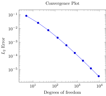
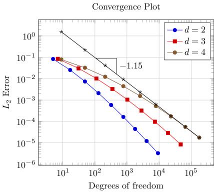
In the use-case here, we assume that the scientific experiment yielded three input data tables: one table for each involved parameter d=2, d=3, d=4. The data tables contain “degrees of freedom” and some accuracy measurement “l2_err”. In addition, they might contain some meta-data (in our case a column “level”). For example, the data table for d=2 might be stored in data_d2.dat and may contain
dof        l2_err     level
5          8.312e-02  2
17         2.547e-02  3
49         7.407e-03  4
129        2.102e-03  5
321        5.874e-04  6
769        1.623e-04  7
1793       4.442e-05  8
4097       1.207e-05  9
9217       3.261e-06  10
The other two tables are similar, we provide them here to simplify the reproduction of the examples. The table for d=3 is stored in data_d3.dat, it is
dof        l2_err     level
7          8.472e-02  2
31         3.044e-02  3
111        1.022e-02  4
351        3.303e-03  5
1023       1.039e-03  6
2815       3.196e-04  7
7423       9.658e-05  8
18943      2.873e-05  9
47103      8.437e-06  10
Finally, the last table is data_d4.dat
dof        l2_err     level
9          7.881e-02  2
49         3.243e-02  3
209        1.232e-02  4
769        4.454e-03  5
2561       1.551e-03  6
7937       5.236e-04  7
23297      1.723e-04  8
65537      5.545e-05  9
178177     1.751e-05  10
What we want is to produce three plots, each dof versus l2_err, in a loglog plot. Plotting the degrees of freedom (that is, some kind of “cost” to achieve the data point) versus the error (accuracy) allows to analyze the precise cost/gain ratio of the prototype. In the case here, we assume (from that deep insight into our prototype which is beyond the motivation) that the relation between degrees of freedom and the accuracy is of exponential nature, more precisely: there is some number a such that e(N) = c * N^a where c is some number which is not of interest, and e(N) is the error achieved with N degrees of freedom.
The visualization should reveal the number ‘a’. Visualization is all about making things clear. And one thing in a plot which is really clear is a straight line. Note that if we apply the natural logarithm to our formula e(N) = c * N^a, we get log e(N) = log (c * N^a) = log(c) + a * log(N). If the X axis would show log(N) and the Y axis would show log e(N), we would have Y = C + a * X. This is a line. The log-transformation is called a loglog plot and we would like to generate a loglog plot with pgfplots. We expect that the result is a line in a loglog plot, and we are interested in its slope log e(N) = -a log(N) because that characterizes our experiment.
Step 1: Getting the data into TeX
Our first step is to get one of our data tables into PGFPlots. In addition, we want axis descriptions for the x and y axes and a title on top of the plot. Our first version looks like
\documentclass{article}
\usepackage{pgfplots}
\pgfplotsset{compat=1.5}

\begin{document}

\begin{tikzpicture}
\begin{loglogaxis}[
    title=Convergence Plot,
    xlabel={Degrees of freedom},
    ylabel={$L_2$ Error},
]
\addplot table {data_d2.dat};
\end{loglogaxis}
\end{tikzpicture}

\end{document}
The code listing shows a couple of important aspects. Here is a brief summary of what we learned already in the first lecture:
- As usual in LaTeX, you include the package using
\usepackage{pgfplots}. - Not so common is
\pgfplotsset{compat=1.5}.A statement like this should always be used in order to (a) benefit from a more-or-less recent feature set and (b) avoid changes to your picture if you recompile it with a later version of pgfplots.
Note that PGFPlots will generate some suggested value into your log file (since 1.6.1). The minimum suggested version is
\pgfplotsset{compat=1.3}as this has great effect on the positioning of axis labels. - PGFPlots relies on TikZ and PGF. You can say it is a “third party package” on top of TikZ/PGF.
Consequently, we have to write each PGFPlots graph into a TikZ picture, hence the
\begin{tikzpicture} ... \end{tikzpicture}environment. - Each axis in PGFPlots is written into a separate environment. In our case, we chose
\begin{loglogaxis} ... \end{loglogaxis}as this is the environment for an axis with double-logarithmic scale.There are more axis environments (especially the
\begin{axis} ... \end{axis}environment for standard axes). Note that you can simply replace loglogaxis with axis – and get a standard axis. The principles like table inclusion and the other remarks here apply for standard axes as well. - Inside of an axis, PGFPlots expects an
\addplot ... ;statement (note the final semicolon).In our case, we use
\addplot table: it loads a table from a file and plots the first two columns.There are, however, more input methods. The most important available inputs methods are
\addplot expression(which samples from some mathematical expression) and\addplot table(loads data from tables), and a combination of both which is also supported by\addplot table(loads data from tables and applies mathematical expressions). Besides those tools which rely only on builtin methods, there is also an option to calculated data using external tools:\addplot gnuplotwhich uses gnuplot as “desktop calculator” and imports numerical data,\addplot shell(which can load table data from any system call), and the special\addplot graphicstool which loads an image together with meta data and draws only the associated axis. - Axis descriptions can be added using the keys
title, xlabel, ylabel.PGFPlots accepts lots of keys – and sometimes it is the art of finding just the one that you were looking for. Hopefully, a search through the table of contents of the reference manual and/or a keyword search through the entire reference manual will show a hit.
Note that trailing commas as above after the “
ylabel={...},” are a good practice: it does not hurt and you won’t forget it for the next option.
Step 2: Adding the remaining data files of our example
PGFPlots accepts more than one \addplot ... ; command – so we can just add our remaining data files:
\begin{tikzpicture}
\begin{loglogaxis}[
    title=Convergence Plot,
    xlabel={Degrees of freedom},
    ylabel={$L_2$ Error},
]
\addplot table {data_d2.dat};
\addplot table {data_d3.dat};
\addplot table {data_d4.dat};
\end{loglogaxis}
\end{tikzpicture}
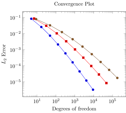
You might wonder how PGFPlots chose the different line styles. And you might wonder how to modify them. Well, if you simply write \addplot without options in square brackets, PGFPlots will automatically choose styles for that specific plot. Here “automatically” means that it will consult its current cycle list: a list of predefined styles such that every \addplot statement receives one of these styles. This list is customizable to a high degree (see the reference manual).
Instead of the cycle list, you can easily provide style options manually. If you write
\addplot[options] ...,
PGFPlots will only use options and will ignore its cycle list. If you write a plus sign before the square brackets as in
\addplot+[options] ...,
PGFPlots will append options to the automatically assigned cycle list.
Step 3: Add a legend and a grid
Adding a legend means to provide a text label for one or more \addplot statements using the legend entries key:
\begin{tikzpicture}
\begin{loglogaxis}[
    title=Convergence Plot,
    xlabel={Degrees of freedom},
    ylabel={$L_2$ Error},
    grid=major,
    legend entries={$d=2$,$d=3$,$d=4$},
]
\addplot table {data_d2.dat};
\addplot table {data_d3.dat};
\addplot table {data_d4.dat};
\end{loglogaxis}
\end{tikzpicture}
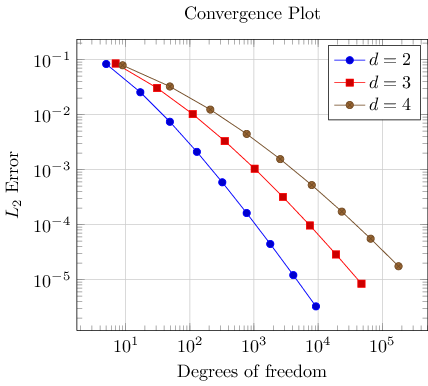
Here, we assigned a comma-separated list of text labels, one for each of our \addplot instructions. Note the use of math mode in the text labels. Note that if any of your labels contains a comma, you have to surround the entry by curly braces. For example, we could have used legend entries={{$d=2$},{$d=3$},{$d=4$}} – PGFPlots uses these braces to delimit arguments and strips them afterwards (this holds for any option, by the way).
Our example also contains grid lines for which we used the grid=major key. It activates major grid lines in all axes.
You might wonder how the text labels map to \addplot instructions. Well, they are mapped by index. The first label is assigned to the first plot, the second label to the second plot and so on. You can exclude plots from this counting if you add the forget plot option to the plot (using \addplot+[forget plot], for example). Such plots are excluded from both cycle lists and legends.
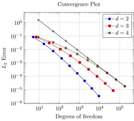
Step 4: Add a selected fit-line
Occasionally, one needs to compute linear regression lines through input samples. Let us assume that we want to compute a fit line for the data in our fourth data table (“data_d4.dat”). However, we assume that the interesting part of the plot happens if the number of degrees of freedom reaches some asymptotic limit (i.e. is very large). Consequently, we want to assign a high uncertainty to the first points when computing the fit line.
PGFPlots offers to combine table input and mathematical expressions (note that you can also type pure mathematic expressions, although this is beyond the scope of this example). In our case, we employ this feature to create a completely new column – the linear regression line:
\usepackage{pgfplotstable}
...

\begin{tikzpicture}
\begin{loglogaxis}[
    title=Convergence Plot,
    xlabel={Degrees of freedom},
    ylabel={$L_2$ Error},
    grid=major,
    legend entries={$d=2$,$d=3$,$d=4$},
]
\addplot table {data_d2.dat};
\addplot table {data_d3.dat};
\addplot table {data_d4.dat};
\addplot table[
     x=dof,
     y={create col/linear regression={y=l2_err,
        variance list={1000,800,600,500,400,200,100}}]
   {data_d4.dat};
\end{loglogaxis}
\end{tikzpicture}
Note that we added a further package: pgfplotstable. It allows to postprocess tables (among other things. It also has a powerful table typesetting toolbox which rounds and formats numbers based on your input CSV file).
Here, we added a fourth plot to our axis. The first plot is also an \addplot table statement as before – and we see that it loads the data file “data_d4.dat” just like the plot before. However, it has special keys which control the coordinate input: x=dof means to load x coordinates from the column named “dof”. This is essentially the same as in all of our other plots (because the “dof” column is the first column). It also uses y={create col/.......}. This lengthy statement defines a completely new column. The create col/linear regression prefix is a key which can be used whenever new table columns can be generated. As soon as the table is queried for the first time, the statement is evaluated and then used for all subsequent rows. The argument list for create col/linear regression contains the column name for the function values y=l2_err which are to be used for the regression line (the x arguments are deduced from x=dof as you guessed correctly). The variance list option is optional. We use it to assign variances (uncertainties) to the first input points. More precisely: the first encountered data point receives a variance of 1000, the second 800, the third 600, and so on. The number of variances does not need to match up with the number of points; PGFPlots simply matches them with the first encountered coordinates.
Note that since our legend entries key contains only three values, the regression line has no legend entry. We could easily add one, if we wanted. We can also use \addplot+[forget plot] table[....] to explicitly suppress the generation of a legend as mentioned above.
Whenever PGFPlots encounteres mathematical expressions, it uses a builtin floating point unit (i.e. it does not need any third-party-tool). Consequently, it has a very high data range – and a reasonable precision as well.
Step 5: Add an annotation using TikZ: a slope triangle
Often, data requires interpretation – and you may want to highlight particular items in your plots. This “highlight particular items” requires to draw into a plots, and it requires a high degree of flexibility. Users of TikZ would say that TikZ is a natural choice – and it is.
In our use-case, we are interested in slopes. We may want to compare slopes of different experiments. And we may want to show selected absolute values of slopes.
Here, we use TikZ to add custom annotations into a PGFPlots axis. We choose a particular type of a custom annotation: we want to mark two points on a line plot. One way to do so would be to determine the exact coordinates and to place a graphical element at this coordinate (which is possible using the PGFPlots coordinate system “axis cs” and \draw .... (axis cs:1e4,1e-5) ... ). Another – probably simpler – way is to use the pos feature to identify a position “25% after the line started”. Based on the result of Step 4, we find
\usepackage{pgfplotstable}
...

\begin{tikzpicture}
\begin{loglogaxis}[
    title=Convergence Plot,
    xlabel={Degrees of freedom},
    ylabel={$L_2$ Error},
    grid=major,
    legend entries={$d=2$,$d=3$,$d=4$},
]
\addplot table {data_d2.dat};
\addplot table {data_d3.dat};
\addplot table {data_d4.dat};
\addplot table[
     x=dof,
     y={create col/linear regression={y=l2_err,
        variance list={1000,800,600,500,400,200,100}}}]
   {data_d4.dat}
   % save two points on the regression line for drawing the slope triangle
   coordinate [pos=0.25] (A)
   coordinate [pos=0.4]  (B)
   ;
\xdef\slope{\pgfplotstableregressiona} % save the slope parameter

\draw (A) -| (B)  % draw the opposite and adjacent sides of the triangle
     node [pos=0.75,anchor=west] {\pgfmathprintnumber{\slope}};
\end{loglogaxis}
\end{tikzpicture}
The example is already quite involved since we added complexity in every step. Before we dive into the details, let us take a look at a simpler example:
\begin{tikzpicture}
\begin{loglogaxis}
\addplot table {data_d2.dat}
   coordinate [pos=0.25] (A)
   coordinate [pos=0.4]  (B)
   ;

\draw[-stealth] (A) -| (B);

\node[pin=0:Special.] at (axis cs:9217,3.261e-06);

\end{loglogaxis}
\end{tikzpicture}

Here, we see two annotation concepts offered by PGFPlots: the first is to insert drawing commands right after an \addplot command (but before the closing semicolon). The second is to add standard TikZ commands, but use designated PGFPlots coordinates. Both are TikZ concepts. The first is what we want here: we want to identify two coordinates which are “somewhere” on the line. In our case, we define two named coordinates: coordinate A at 25% of the line and coordinate B at 40% of the line. Then, we use \draw (A) -| (B) to draw a triangle between these two points. The second is only useful if we know some absolute coordinates in advance.
Coming back to our initial approach with the regression line, we see that it uses the first concept: it introduces named coordinates after \addplot, but before the closing semicolon. The statement \xdef\slope introduces a new macro. It contains the (expanded due to the “eXpanded DEFinition”) value of \pgfplotstableregressiona which is the slope of the regression line. In addition to the slope triangle, we also add a node in which we typeset that value using \pgfmathprintnumber.
Summary
We learned how to define a (logarithmic) axis, and how to assign basic axis descriptions. We also saw how to use one or more \addplot table commands to load table data (csv format, in this case tab-separated) into PGFPlots. We took a brief look into regression and TikZ drawing annotations.
Next steps might be how to visualize functions using line plots, how to align adjacent graphics properly (even if the axis descriptions vary), how to employ scatter plots of PGFPlots, or how to draw functions of two variables. If you have not read it, you may want to read the first article in this series FIXME LINK.
You may want to read the slides of an introductory talk about PGFPlots and the reference manual of PGFPlots for more details.