I’m fairly sure everyone has, at least on one occassion, toyed with the idea of using tiled patterns as the background on a Beamer presentation or a report. (Whether this is good taste is another issue.)
In this article, we will speak about an efficient technique for creating tiling backgrounds based on few patterns but resulting in a visual effect of a non-repeating pattern.
Strictly speaking, this isn’t about graphics in LaTeX per se, but I had a lot of fun when I read about the underlying principle, so here goes.
There are many free, high-quality tile patterns out there: try subtlepatterns.com, DinPattern and COLOURlovers.com. And while there are more than one way to get tiled-pattern backgrounds in LaTeX, I usually ‘cheat’ a little by using the wallpaper package, which provides a \TileWallPaper{«width»}{«height»}{«filename»} command. The package provides commands for specifying a single graphics file at the corners or center of the paper as well; see the package manual or this post for more information. It’s included in both MikTeX and TeXLive. Here I’m using \TileWallPaper in my background canvas template of a Beamer presentation:
\documentclass{beamer}
\usepackage{eso-pic}
\usepackage{wallpaper}
\usepackage{graphicx}

% I usually give the proportion measurements of the tile by
% referring to the dimensions (in pixels) of the original
% graphics, while keeping an eye on the resolution
\setbeamertemplate{background canvas}{
  \TileWallPaper{51.5pt}{11.5pt}{arches}
}

\begin{document}
\begin{frame}
  \frametitle{Tiled-Pattern Backgrounds}
  \begin{itemize}
    \item Maths is cool.
    \item And so are \TeX\ & friends.
    \item They make powerful designs.
  \end{itemize}
\end{frame}
\end{document}
“Arches” tile image courtesy of SubtlePatterns.com, 103px x 23 px, 813 bytes
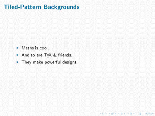
Beamer slide with regular ripples tiled background. (31 KB PDF)
Simple, regular patterns usually work well when tiled, as is the arches pattern above. However, if your pattern is something more textured, the resultant look is very often too regular and artificial:
“The Big Show” tile image 1 courtesy of The Cicada Project, 109px x 917px, 5.9 KB
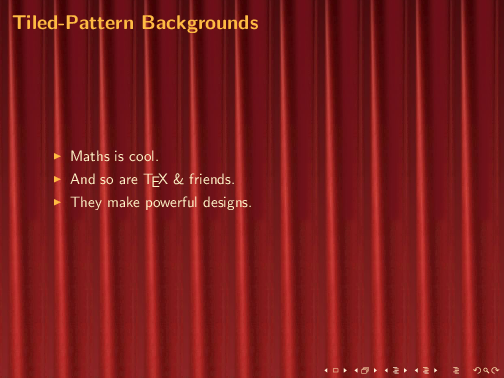
Beamer slide with regular curtain tile background.
You could, of course, source for full-page textures for more natural-looking textures, e.g. on DeviantArt. But this usually means a much larger graphics file: easily 1 or 2 MB for a good resolution file. This will certainly increase the file size of your output PDF: not usually a desirable consequence.
Alex Walker wrote about what he called the Cicada Principle, a technique for “creating efficient tiling backgrounds that don’t appear to repeat”. Essentially, this involves creating a set of semi-transparent pattern tiles of different sizes, whose dimensions correspond to a scaled sequence of prime numbers. As a result, when these tiled patterns are layered on top of each other, you get a visual effect of a non-repeating pattern; i.e. not until after some really big interval. (Think about the lowest common denominator of prime numbers.) And yet the total file size of the graphics used remains small, in comparison to a full-screen texture graphics file.
Multiple \TileWallPaper commands accummulate, i.e. the graphics will be stacked on top of one another. So let’s use these two other tile patterns in our Beamer presentation:

“The Big Show” tile image 2 courtesy of The Cicada Project, 900px x 317px, 15 KB
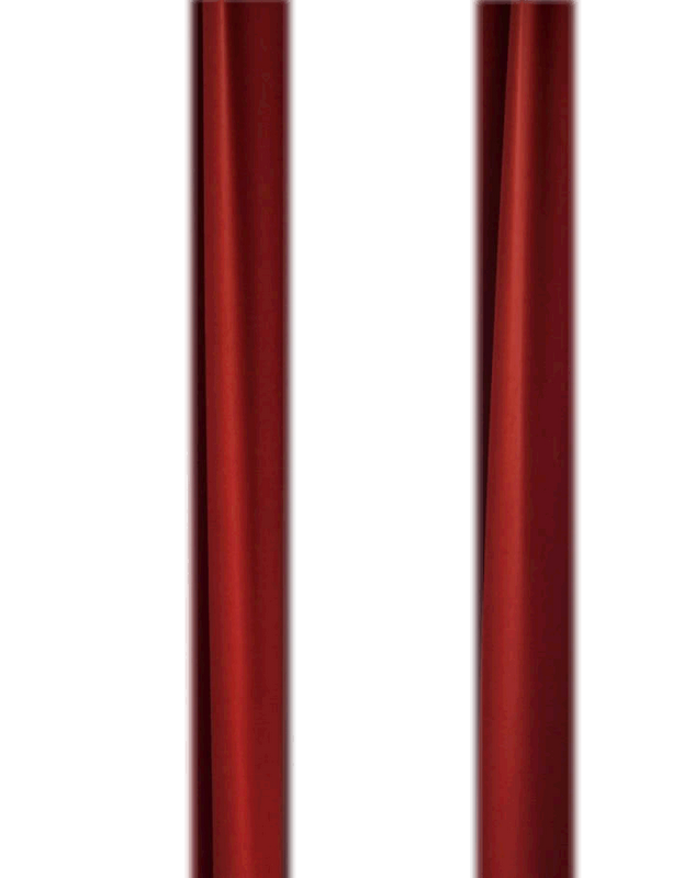
“The Big Show” tile image 3 courtesy of The Cicada Project, 900px x 703px, 167 KB
Let’s try adding curtain2.png in our beamer background canvas definition:
\setbeamertemplate{background canvas}{
 \TileWallPaper{32.7pt}{275.1pt}{curtain1}
 \TileWallPaper{90pt}{275.1pt}{curtain2}
}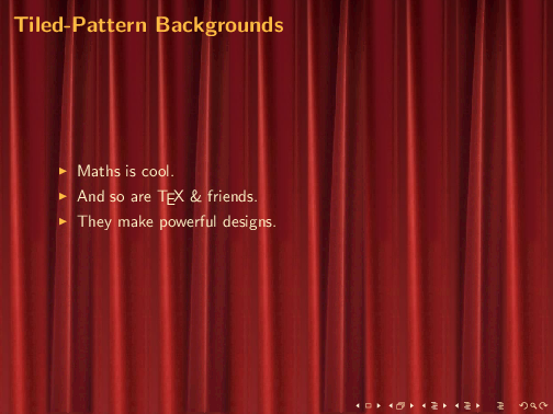
Hmmm, at this point, the monotiny starts to break down: a great improvement over the first attempt. And when we add the third pattern:
\setbeamertemplate{background canvas}{
\TileWallPaper{32.7pt}{275.1pt}{curtain1}
\TileWallPaper{90pt}{275.1pt}{curtain2}
\TileWallPaper{210.9pt}{275.1pt}{curtain3}
}
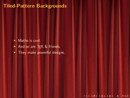
Beamer slide with 3 curtain tiles (113 KB PDF, 52.21 KB total graphics file size)
That actually looks quite nice, as if a full-sized background graphics was used. And the output PDF file (with just this one slide) is a mere 113 KB, using only 52.21 KB of graphics files.
You can do this similarly for, say, a magazine-style report, or any document, for that matter. Here’s an example with the Parchment tiles from the Cicada Project:
\documentclass[14pt]{scrartcl}
\usepackage{wallpaper}
\usepackage{graphicx}
\usepackage{lipsum}

\TileWallPaper{150pt}{150pt}{texture_01}
\TileWallPaper{530pt}{700pt}{texture_02}
\TileWallPaper{410pt}{900pt}{texture_04}
\begin{document}
...
\end{document}
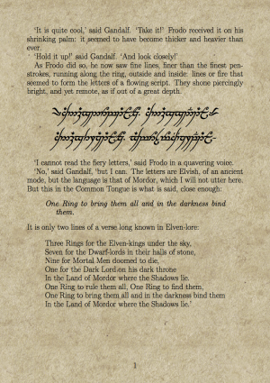
Book with Parchment tiles (204.41 KB total graphics file size. I’ve been dying for a chance to do something like this 😉 )
The The Cicada Project Gallery contains many pattern submissions that you can experiment with, but you can certainly design your own patterns (and submit them) too. Alex listed a few tips for designing ‘Cicada’ tiles in his post:
- Design the stacking order and size of your tiles like an upside-down pyramid.
- The bottom layer can be quite small and repetitive.
- The upper-most layer should have the largest dimension, and also the sparsest imagery.
- Avoid highly distinctive, eye-catching details in the upper most layer.
- Trial and error!
And I just cannot resist ending this by posting some more examples, using tiles from the Cicada Project gallery. And an additional benefit of this little exercise: the next time your kid (or anyone) complains “maths is no fun”, you have one more example to show him or her how maths is really cool!
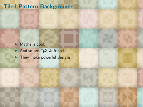
Quilts (113.31 KB total graphics file size)
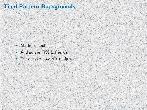
Granite (321.07KB total graphics file size)
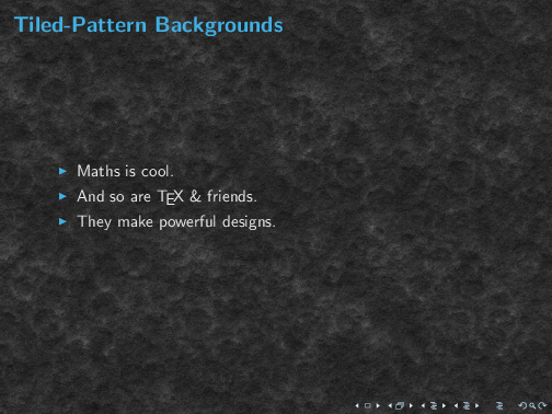
On the Moon (160.57 KB total graphics file size)
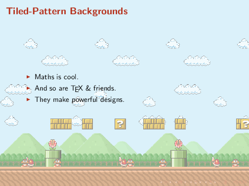
Mario Brothers (33.33 KB total graphics file size)
P/S: I quite realise some patterns are just too distractive and quite unusable as presentation backgrounds. Like the final example. But like I said, I couldn’t resist. 🙂 I hope you enjoyed it as much as I did!

